http://chiliweb.southalabama.edu/data_products.php
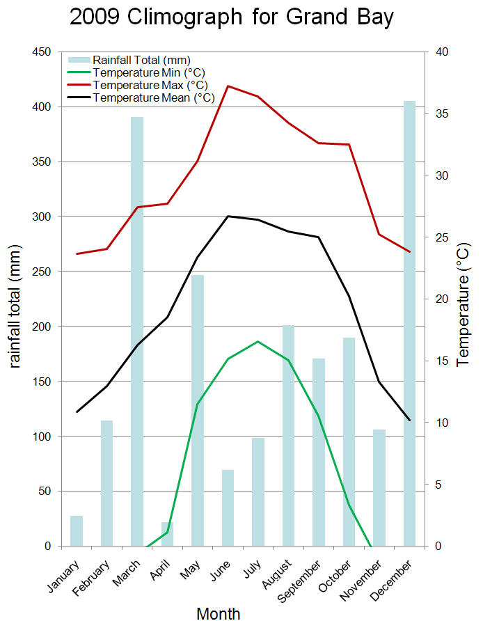
Above is a climograph for southern Alabama. Climograph are used to show average monthly temperature and precipitation for a certain area, they help to show the relationship between temperature and rainfall.
http://en.wikipedia.org/wiki/Wind_rose
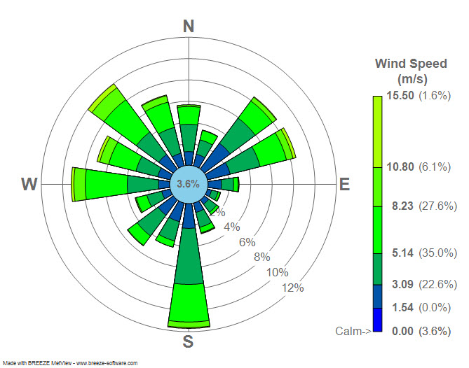
A Windrose, most commonly used by meteorologist, is a circular plot displaying different wind speeds and directions.
http://en.wikipedia.org/wiki/Scatter_plot
A Scatter Plot uses an X and Y axis to chart point on a coordinate. Scatter plots are used to help determine if there is a correlation between two variables. For example if you put temperature on the x axis and ice cream sales on the y axis, one could assume that as temperatures climbed so would ice cream sales.
http://waterwatch.usgs.gov/index.php?r=us&m=real&w=plot
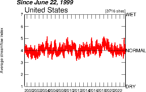
The Index Value Plot above shows average rainfall in the US from 1999 to 2012. Instead of starting at an abosolute number, an index value plot uses an index which is derived from a formula using the raw data given. Once you have the index, it can be used to create a visual graph of your data in an index value plot,
http://www.unc.edu/depts/econ/byrns_web/Economicae/Figures/Lorenz.htm An accumulative line graph, also known as a Lorenz curve, is most commonly used in economics.The Lorenz curve shown above illustrates the cumulative share of the income earned by people from lowest to highest incomes.