http://www.micrometgroup.com/doppler_radar.php
The Doppler radar image above is of Hurricane Katrina as it hit land fall along the gulf coast. You can see as you get closer to the middle of the storm it begins to intensify.
Monday, July 15, 2013
Black and White Aerial Photo II (52)
http://album.atlantahistorycenter.com/store/Products/79212-atlanta-fulton-county-stadium.aspx
The black and white picture above is of Atlanta, Ga. Up front you can see the old Fulton County Stadium, where the Atlanta Braves played when they originally moved to Atlanta from Milwaukee. Past the stadium, which has since been demolished and Turner Field has been constructed, you can see downtown Atlanta.
Flow Map II (51)
http://www.mundi.net/maps/maps_014/
The map pictured above is a handcrafted telecommunications traffic flow map for the European region. I thought this map was interesting because of what it maps. Mapping the flows of goods and people is relatively easy, but mapping communications of the Net is much more difficult, but this map does an excellent job of it and is considered to be one of the better flow maps of telecommunications for the region.
Tuesday, July 2, 2013
Population Profile (50)
A Population Profile shows the age and gender distrution of the population for a given area. Pictured above is population profile for Eastern Cape in South Africa.
Climograph (49)
http://chiliweb.southalabama.edu/data_products.php
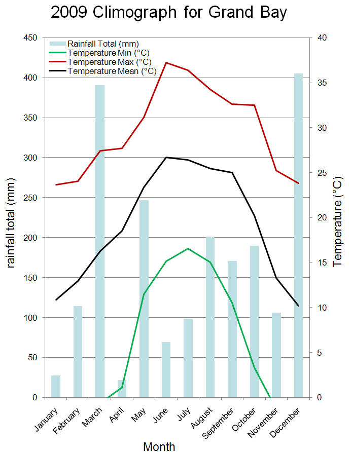
Above is a climograph for southern Alabama. Climograph are used to show average monthly temperature and precipitation for a certain area, they help to show the relationship between temperature and rainfall.
Windrose (48)
http://en.wikipedia.org/wiki/Wind_rose
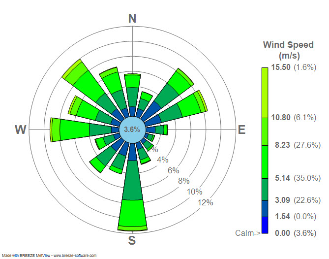
A Windrose, most commonly used by meteorologist, is a circular plot displaying different wind speeds and directions.
Monday, July 1, 2013
Scatter Plot (47)
http://en.wikipedia.org/wiki/Scatter_plot
A Scatter Plot uses an X and Y axis to chart point on a coordinate. Scatter plots are used to help determine if there is a correlation between two variables. For example if you put temperature on the x axis and ice cream sales on the y axis, one could assume that as temperatures climbed so would ice cream sales.
Index Value Plot (46)
http://waterwatch.usgs.gov/index.php?r=us&m=real&w=plot
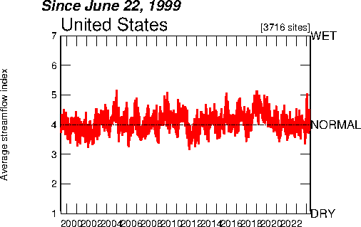
The Index Value Plot above shows average rainfall in the US from 1999 to 2012. Instead of starting at an abosolute number, an index value plot uses an index which is derived from a formula using the raw data given. Once you have the index, it can be used to create a visual graph of your data in an index value plot,
Accumulative line graph (45)
http://www.unc.edu/depts/econ/byrns_web/Economicae/Figures/Lorenz.htm
An accumulative line graph, also known as a Lorenz curve, is most commonly used in economics.The Lorenz curve shown above illustrates the cumulative share of the income earned by people from lowest to highest incomes.
Bilateral graph (44)
http://www.gallup.com/poll/106858/chinas-leadership-better-regarded-outside-west.aspx
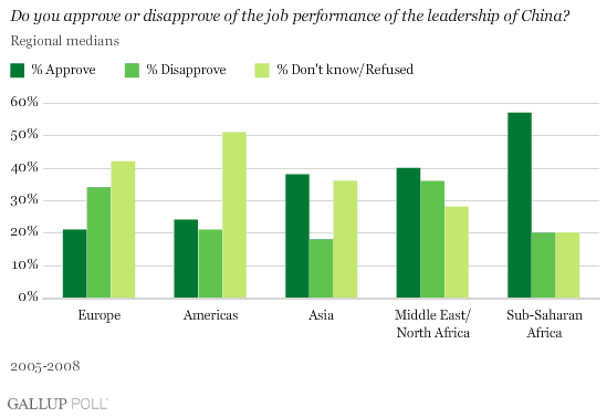
Bilateral Graphs compare two or more sets of data in a visual graph, very similar to a bar graph, only with more bars. This particular Bilateral graph shows how certain countries approve or disapprove of the performance of leadership of China.
Triangular Plot (43)
http://www.ex-parrot.com/~chris/wwwitter/20050407-it_doesnt_matter_how_you_vote_either_way_your_planet_is_doomed.html
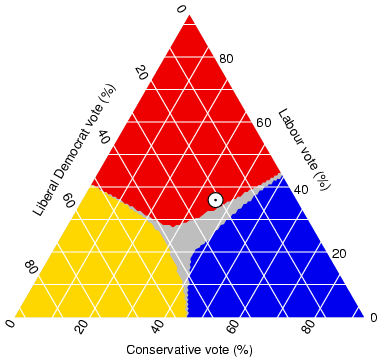
Triangular Plots are used to combine and compare three different variables. In this case we are looking at the three major political parties in the UK.
Friday, June 28, 2013
Parallel Coordinate Graph (42)
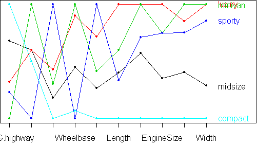
A Parallel Coordinate Graph is a common way of analyzing multi-variable data. In this particular graph we are comparing five different cars across several different characteristics.
Histogram (41)
http://en.wikipedia.org/wiki/Histogram
A histogram is a graphical representation showing a visual impression of the distribution of data. In the image pictured above, the histogram is showing the frequency of how tall, in feet, black cherry trees are.
Tuesday, June 25, 2013
Nominal Area Choropleth (40)
http://www.patriotnewsalert.com/ElectionMap2008.htm
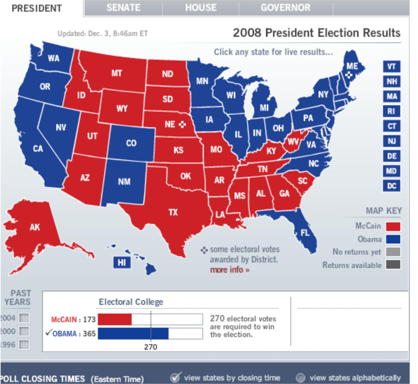
Unlike a standard choropleth map, where color, or tint, changes as the variable changes. In the Nominal Area Choropleth the tint goes one way or the other, in the map above it goes red or blue. If Obama won the state it goes blue, the percentage is not shown, If McCain won the state, it goes red, but the map does not give what percentage of voters voted for McCain or Obama.
Univariate Choropleth (39)
http://www.clearlyandsimply.com/clearly_and_simply/2009/06/multicolored-choropleth-maps-with-excel.html
This Univariate Choropleth, pictured above, shows the different terms for soda, or pop, across the U.S. It is the only variable shown on this map, which is what gives it its name.
Bivariate Choropleth (38)
http://www.geo.unizh.ch/~annal/Choropleth%20maps.html
This Bivariate Choropleth map shows the percentage of the population under 18 and the percentage of rural population in Warsaw.
Unclassed Choropleth (37)
http://xweb.geos.ed.ac.uk/~mscgis/07-08/s0788692/
The unclassed choropleth pictured above is showing the infant mortality rate in africa. This map differs from the classed choropleth because its scale is no divided into ranges, just one scale by shade.
Classed Choropleth (36)
http://my.ilstu.edu/~jrcarter/Geo204/Choro/Tom/The classed Choropleth above compares the percent of Hispanics and Latinos in Florida. From a quick look at the map one can determine that most Hispanics and Latinos live in south Florida
Wednesday, June 19, 2013
Box Plot (35)
http://en.wikipedia.org/wiki/Box_plot
A box plot is a convenient way of graphically depicting groups of numerical data through their five number summaries: the smallest observation, lower quartile (Q1), median (Q2), upper quartile(Q3), and largest observation.
Stem and Leaf Plot (34)
This is a very simple stem and leaf plot that has a total of 17 raw data items. The ones digit is the leaf and the tens digit is the stem. So the stem 4 and leaf 6 is representing the number 46.
Subscribe to:
Posts (Atom)