Friday, June 28, 2013

Parallel Coordinate Graph (42)


http://alumni.media.mit.edu/~tpminka/courses/36-350.2001/lectures/day38/
A Parallel Coordinate Graph is a common way of analyzing multi-variable data. In this particular graph we are comparing five different cars across several different characteristics.

Histogram (41)

http://en.wikipedia.org/wiki/Histogram
A histogram is a graphical representation showing a visual impression of the distribution of data. In the image pictured above, the histogram is showing the frequency of how tall, in feet, black cherry trees are.

Tuesday, June 25, 2013

Nominal Area Choropleth (40)

http://www.patriotnewsalert.com/ElectionMap2008.htm
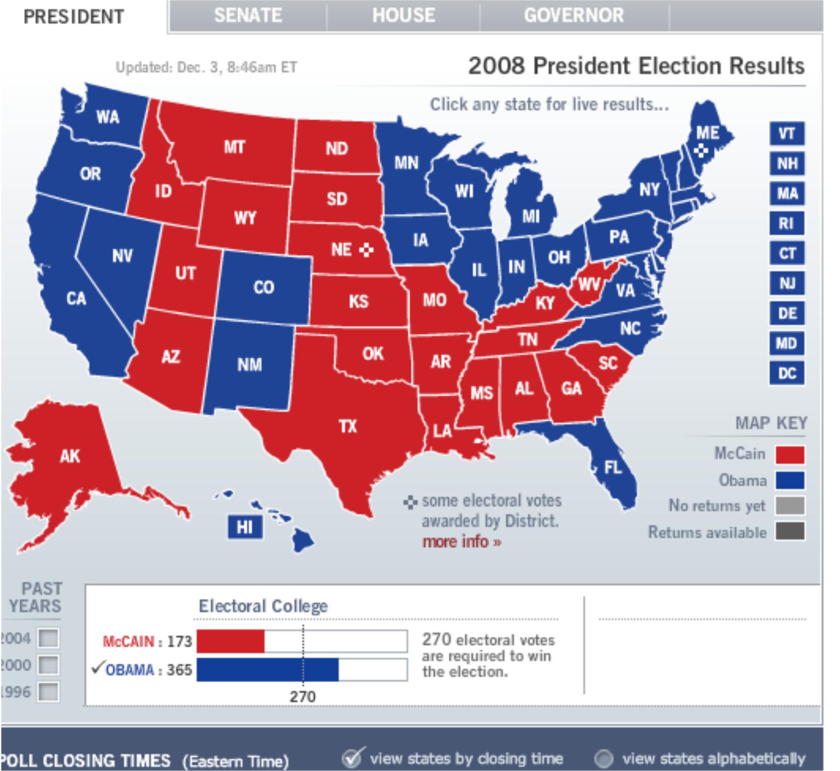
Unlike a standard choropleth map, where color, or tint, changes as the variable changes. In the Nominal Area Choropleth the tint goes one way or the other, in the map above it goes red or blue. If Obama won the state it goes blue, the percentage is not shown, If McCain won the state, it goes red, but the map does not give what percentage of voters voted for McCain or Obama.

Univariate Choropleth (39)

http://www.clearlyandsimply.com/clearly_and_simply/2009/06/multicolored-choropleth-maps-with-excel.html
This Univariate Choropleth, pictured above, shows the different terms for soda, or pop, across the U.S. It is the only variable shown on this map, which is what gives it its name.

Bivariate Choropleth (38)

http://www.geo.unizh.ch/~annal/Choropleth%20maps.html
This Bivariate Choropleth map shows the percentage of the population under 18 and the percentage of rural population in Warsaw.

Unclassed Choropleth (37)

http://xweb.geos.ed.ac.uk/~mscgis/07-08/s0788692/
The unclassed choropleth pictured above is showing the infant mortality rate in africa. This map differs from the classed choropleth because its scale is no divided into ranges, just one scale by shade.

Classed Choropleth (36)

http://my.ilstu.edu/~jrcarter/Geo204/Choro/Tom/The classed Choropleth above compares the percent of Hispanics and Latinos in Florida. From a quick look at the map one can determine that most Hispanics and Latinos live in south Florida

Wednesday, June 19, 2013

Box Plot (35)

http://en.wikipedia.org/wiki/Box_plot
A box plot  is a convenient way of graphically depicting groups of numerical data through their five number summaries: the smallest observation, lower quartile (Q1), median (Q2), upper quartile(Q3), and largest observation.

Stem and Leaf Plot (34)

http://www.northstarmath.com/sitemap/Stem-and-LeafPlot.html
This is a very simple stem and leaf plot that has a total of 17 raw data items. The ones digit is the leaf and the tens digit is the stem. So the stem 4  and leaf 6 is representing the number 46.

Range Graded Proportional Circle Map (33)

https://www.e-education.psu.edu/geog486/book/export/html/1796The map above is a range graded proportional circle map of motor vehicle deaths in the state of California. Each circle size represents a different range of deaths by county.

Similarity Matrix (32)

http://www.fxpal.com/?p=eventDetectorA similarity matrix shows similarity between variables on a scale.The matrix above shows the similarity of 512 photos.

Monday, June 17, 2013

Correlation Matrix (31)

http://www.livestockgenomics.csiro.au/Genome_to_Phenome/
A Correlation Matrix represents the strength and connection between two random variables. For example, One could argue that there is a strong correlation between the number of ice cream cones sold and the number of swimming accidents per month, because of the weather. During summer time months people buy more ice cream cones, and more people are swimming, and if more people are swimming your chances of having an accident go up. This particular matrix shows the correlation between two random genes.

Star Plot (30)

http://www.itl.nist.gov/div898/handbook/eda/section3/starplot.htm
Star plots are used to compare multiple variables at one time. In the star plot above you can compare two different vehicles on eight different characteristics at one time just by taking a quick glance at each ones star plot.

Statistical Map (29)

http://synapse.princeton.edu/~sam/pollcalc.html
The map above is a statistical map of the predicted presidential election between former president Bush and Kerry. This is a statistical map because each states size has been adjusted to represent its electoral votes.

Mental Map (28)

http://www.fedstats.gov/kids/mapstats/concepts_mentalmaps.htmlA mental map shows what a person knows about a particular location and what landmarks they use. Every mental map is different. I grew up in a sub-division with one street, but if you asked my brother and I to draw mental maps of the sub-division, while they might be similar, they would not be identical. The mental map above is drawn based on someone's mental image of Nottingham City Centre 1997

Friday, June 14, 2013

Planimetric maps (27)

http://www.ncdot.gov/doh/preconstruct/highway/photo/Products/Planimetric_maps_default.html
Planimetric maps are essentially basic street maps. They show how to get around certain places with street names and landmarks. Every FSU student is given a planimetric map at their orientation, which shows how to get around campus.

Topographic map (26)

http://en.wikipedia.org/wiki/Topographic_mapI used this same map for my DRG map. The DRG is a scan of a topographic map for computer use. A topographic map is a detailed and accurate graphic representation of cultural and natural features on the ground. This map is of from a series of topographic Stowe,VT.

Thursday, June 13, 2013

Thematic Map (25)

 http://www.gigawiz.com/thematic.html

A thematic map is a type of map or chart especially designed to show a particular theme connected with a specific geographic area. These maps can portray physical, social, political, cultural, economic, sociological, agricultural, or any other aspects of a city, state, region, nation, or continent. The map the US above shows political party affiliation by governors' office in January of 2007.

Cadastral Map (24)

https://commons.wikimedia.org/wiki/File:Cadastral_map_of_Brno.svg
Cadastral maps show ownership of property, real estate. This map shows Brno in the Czech republic divided into respective areas.

Tuesday, June 11, 2013

PLSS map (23)

http://www.nationalatlas.gov/articles/boundaries/a_plss.html
The map above is a PLSS, Public Land Survey System, of the US. The PLSS system is used in the US to divide public lands owned by the government for the benefit of US citizens.

Hypsometric Map (22)

http://en.wikipedia.org/wiki/File:Uk_topo_en.jpg
Hypsometric maps represent different elevations by means of tinting, in this map the higher the elevation the more red the color gets on the map. This map shows the of where one of my siblings works, the United Kingdom.

Choropleth Map (21)

http://en.wikipedia.org/wiki/Choropleth_map
A Choropleth map is defined as a thematic map in which areas are shaded or patterned in proportion to the measurement of the statistical variable being displayed on the map. The map above shows the presidential election of 2004.

Monday, June 10, 2013

Isoline map (20)

http://www.esri.com/news/arcwatch/0207/feature.html
This Isoline map, similar to the other Iso- maps uses contour lines to represent data. In this particular image each blue line represent rainfall in Hawaii. 

Flow Map (19)

http://urbaninfill.wordpress.com/2010/09/13/considering-ohios-transportation-future/
The Flow Map above shows Delta flights across the US. From the map one can easily tell where Delta has their HUBS, where most flights fly into and out of. For example even though Tallahassee and Pensacola are very close to each other there is no direct flight from Tallahassee to Pensacola, you have to fly through Atlanta first.

Cartographic Animation (18)

http://blog.outerbanksvacations.com/2011/08/24/outer-banks-hurricane-irene-update-8-24-11-900-pm/hurricane-irene-projected-path-8-24-11-9-pm/
Most people do not know it but, Cartographic animation can be seen every day just by watching the weather channel. Any time they show the projected path of a storm, like the image above, or high/low pressures moving across the country, or even projected Doppler images, these are all forms of cartographic animation. The image above is the projected path of hurricane Irene in 2011.

Infrared Aerial Photo (17)

http://www.aerialarchives.com/infrared.htm
Infrared Aerial Photo is very similar to the Black and White Aerial Photo, Only they can pick up on changes to the environment that might not be readily visible. The image above is of the Sacramento deep water channel.

Sunday, June 9, 2013

Black and White Aerial Photo (16)

http://www.floridamemory.com/items/show/103598
The aerial photo above is of Pensacola Beach, Florida, taken in 1961. Growing up in Pensacola is amazing to me how different it looks today.As you can see in the image above, these maps do a good job of making the shorelines and roads stick out.

LIDAR (15)

http://www.noaanews.noaa.gov/stories/s798.htm
The LIDAR, light detection and ranging, above displays lower Manhattan, more specifically ground zero after the World Trade Center terrorist attack. LIDAR uses laser during an aerial flyover to collect data and reconstruct a 3-D image of the mapped area, in this case ground zero. 

Friday, June 7, 2013

Digital Raster Graphic (14)


http://en.wikipedia.org/wiki/Digital_raster_graphic
A digital raster graphic is the result of a scan of a USGS topographic map for use on a computer. The DRG above is a portion of of a DRG taken of Stowe, VT

Digital Line Graph (13)


http://tahoe.usgs.gov/DLG.html
A Digital Line Graph is a map of geographic features that is made from digital vector data to represent cartographic information. There are three different scales for digital Line Graphs, large scale, intermediate scale, and small scale. The map pictured above is of the Lake Tahoe area.

Digital Orthographic Quarter-Quad (12)


http://www.fireimaging.com/fires/2007/california/colina/253/index.html
A Digital Ortho Quarter Quad (DOQQ) is a digital image shown as an orthographic projection. It is also a combination of the best qualities of an aerial photograph and a map. The image above is of wild fires in California.

Tuesday, June 4, 2013

Continuously Variable Proportional Circle Map (11)


http://www.neiu.edu/~nerobert/Cartography.htm
The continuously variable proportional circle map above shows the American Indian population by state across the western US. The size of each circle represents the number of American Indians per state, which in this case is the measured variable.

Isobars (10)

http://ww2010.atmos.uiuc.edu/%28Gl%29/guides/maps/sfcobs/cntr/wind.rxml
Isobars are points of equal pressure in atmosphere. This Isobar map shows equal points of pressure over the eastern US and how wind patterns are affected by pressure.

Isotachs (9)

http://www.crh.noaa.gov/lmk/?n=basic-fronts
This map shows Isotachs over the US. Isotachs shows contours of different wind speeds. Each color shows different wind speeds, or jet stream.

Isopleth (8)

http://www.nature.nps.gov/air/edu/lessons/figure3.cfmIsopleths are another form of contour maps, such as the Isopach and Isohyets also mentioned in this blog. The Isopleth is used if the specific variable being displayed can not be pinpointed. This map shows the distribution of rain fall across the US in 1996. In this map, similar to the other contour maps, each contour represents a different level of rainfall.

Isohyet map (7)

 
Isohyet maps depict an elevation of some kind. In this particular map the mean annual rainfall over an ocean is being depicted in each Isohyet, each color contour.

Cartogram (6)

http://www.brainpickings.org/index.php/2010/04/15/cartograms/
This cartogram shows the land area of the world, but it is distorted to demonstrate the overpopulation of certain countries. India and China are huge in comparison to other countries because they are the most populated.